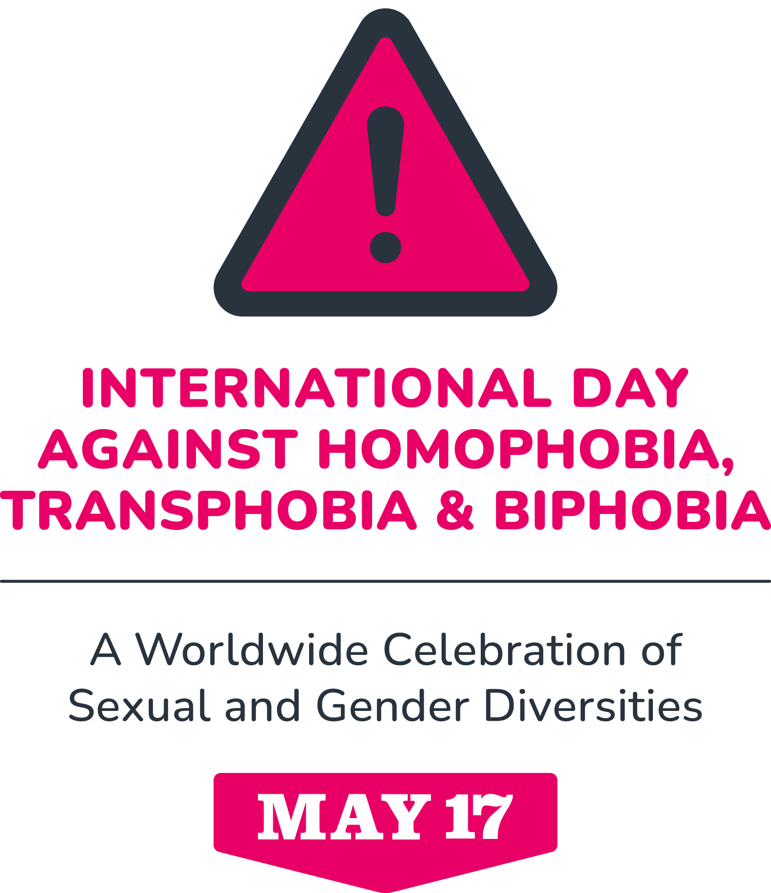
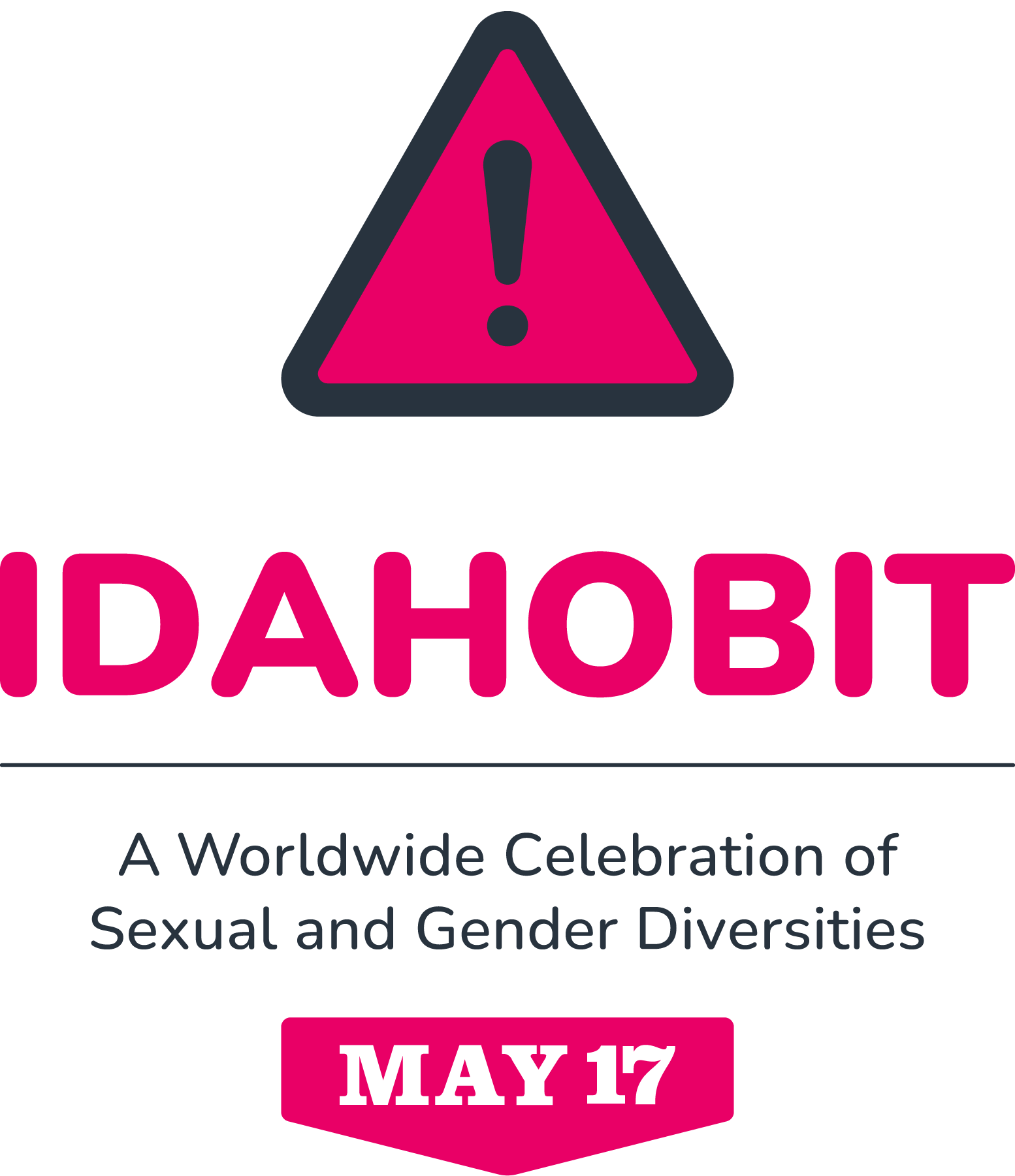
The IDAHOBIT logo and visual elements are made available to support organisers, institutions, and communities in clearly connecting their events to the global initiative.
Whether you’re preparing a social media post, designing an event flyer, or producing a banner, feel free to include the logo to show your engagement with IDAHOBIT.
These basic visual guidelines are here to help ensure consistency while making it easier for people across different regions and sectors to use the logo effectively.
The logo can be placed on materials such as event posters, websites, publications, or digital communications related to your IDAHOBIT activities. This helps create a sense of global connection across our many events.
Please make sure the logo is only used in connection with the initiative’s values and goals: supporting LGBTQIA+ rights, dignity, safety, and equality.
If you have any questions about usage, feel free to contact us.
IDAHOBIT logo
The pink triangle with an exclamation mark has historically been used to identify the IDAHOBIT initiative. Its origins lie in the Nazi regime, where it was used to mark homosexual men in concentration camps. Since then, LGBTQIA+ communities have reclaimed the symbol, transforming it from a tool of persecution into one of resistance, strength, and collective power.
Logomark
The IDAHOBIT logomark offers the greatest flexibility and is recommended for compact formats or where space is limited. It includes a subtle white outline to ensure visibility on dark backgrounds. The outline is always present, but only noticeable when contrast requires it.
Full logo
This version includes the logomark, the full name of the Day, the tagline, and an icon. Due to the amount of text, it is best used in contexts where there is enough space to maintain clear legibility.
Simplified logo
This version replaces the full name of the Day with its acronym, keeping the rest of the elements unchanged. Because of its shorter text, this version is more adaptable and often preferred when working across different formats and sizes.
IDAHOBIT colours
The primary colours are a powerful pink and dark grey. Tints or shades are available to ensure a high contrast ratio—while still staying within the overall colour palette. Secondary colours were created to complement the primary colours and to add variety and depth to the colour palette.
As the IDAHOBIT logo is mainly used on web or screen applications, the colours are shown only in HEX code and RGB.
PINK POWER
RGB: 233, 0, 102
HEX: #E90066
ALMOST BLACK
RGB: 40, 51, 62
HEX: #28333E
DARKEST PINK
RGB: 155, 0, 68
HEX: #9B0044
DARK PINK
RGB: 192, 0, 85
HEX: #C00055
LIGHT PINK
RGB: 248, 170, 200
HEX: #F8AAC8
GOLDEN JOY
RGB: 255, 139, 0
HEX: #FF8B00
BLUE HEALING
RGB: 0, 159, 181
HEX: #009FB5
PURPLE MAGIC
RGB: 144, 12, 148
HEX: #900CC6
Typeface
Nunito is the main typeface used on our communications.
The IDAHOBIT title uses Nunito Black in upper caps and the tagline uses Nunito Medium.
Nunito is a well-balanced rounded sans-serif typeface created for display typography.
It can be downloaded from Google Fonts.
Primary typefaceNunito
Aa
Aa
Aa
Whenever a writing system is not supported by Nunito, Noto Sans should be used in the visually-corresponding weight. Noto is a global font collection for writing in all modern and ancient languages.


